
You need to see Front Mission 3 Remake's redone Network graphics and photographs
This week, the 1999 classic SRPG Front Mission 3 is receiving a remake. This is a huge deal, as it's the first time this game has been re-released outside of the PS1 original. Mech and tactical RPG people are excited, but both Paul (whose review is coming soon) and I (who reviewed it over at our sister site, Nintendo Insider) found this remake to be a disappointment. Personally, my issues mainly have to do with the presentation being a significant downgrade.
Let's get into those presentation issues. It appears that publisher Forever Entertainment and developer Megapixel Studios SA decided to feed all of the game's original 2D art assets into some form of upscale algorithm, sometimes dramatically altering the content of the original image. The results are mixed to say the least. We decided to revisit the opening hours of both the new remake and the PS1 version in order to get direct comparisons for you all.
We can most immediately see Forever Entertainment's approach with the character portraits, which seem to be an upscale of the pixelated ones used directly in the PS1 original. Here's an example:
[Note: for any image in this article, if you are on a desktop browser, you can click the image to expand. Left and right arrows should let you cycle through all images shown on this page.]
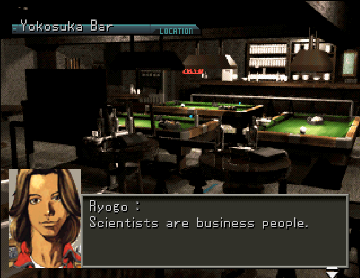
Algorithmic upscaling has been used for many PS1-era remasters, given that the industry has a pretty bad track record of retaining source code and having access to high-quality original assets. These portraits are decent-at-best upscale, but not incredibly offensive compared to other examples shared later in this article. Besides, maybe a high-quality sprite sheet for every sprite no longer existed.
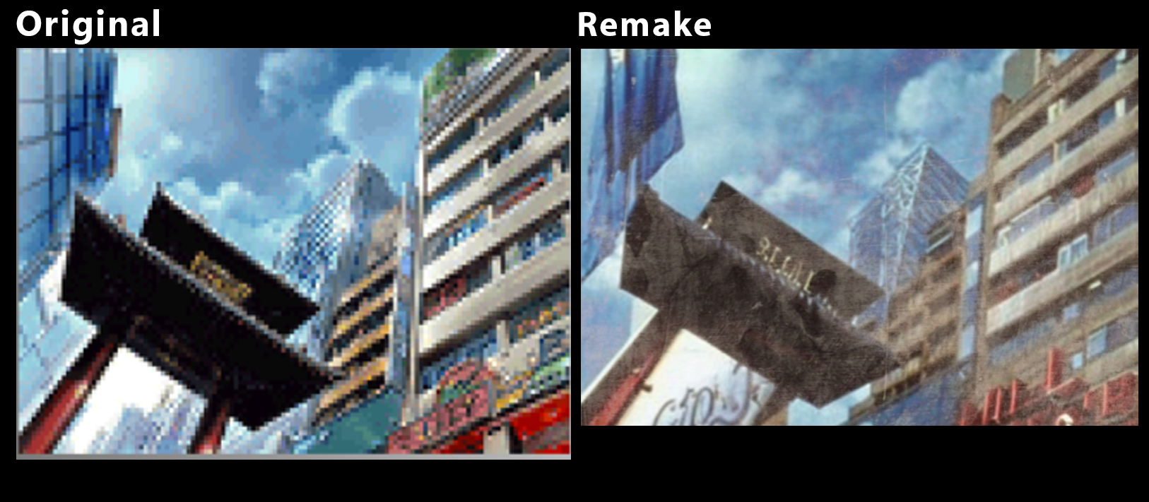
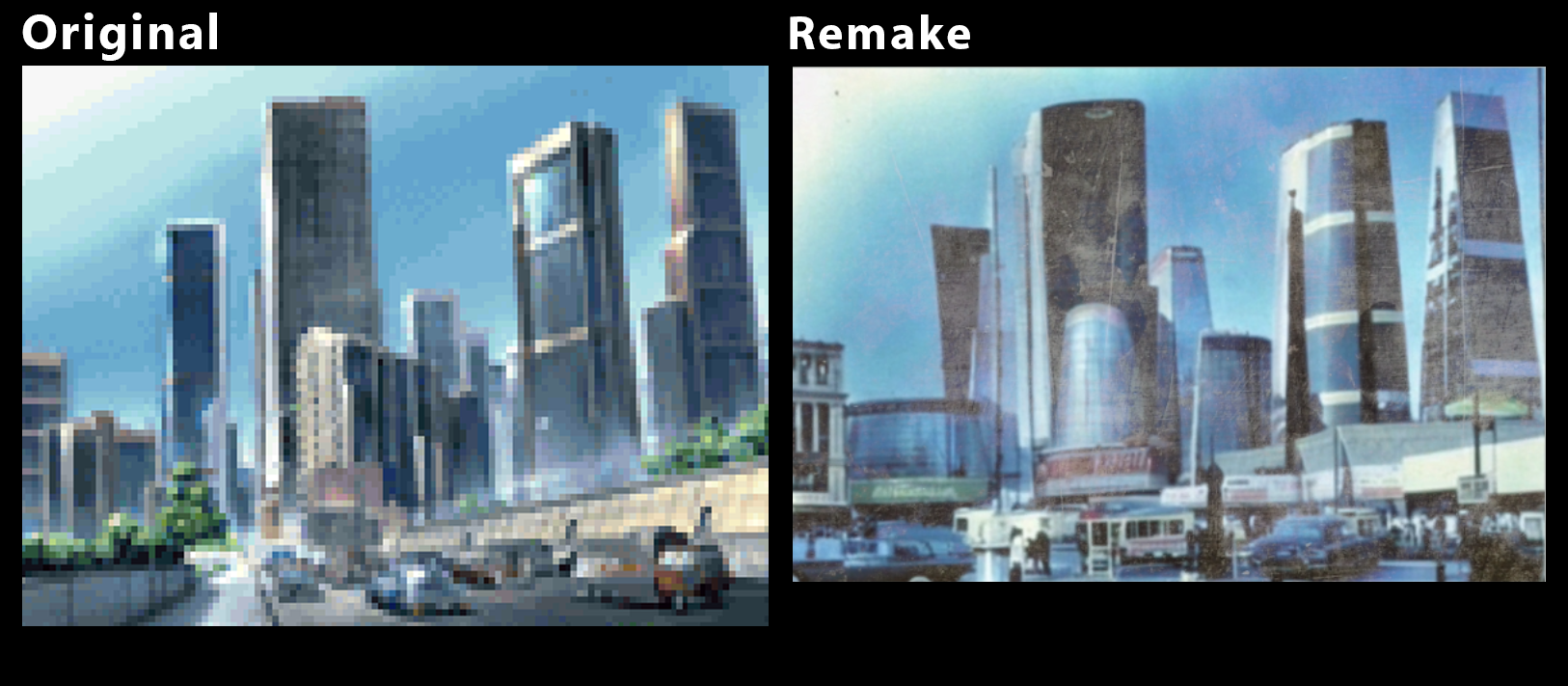
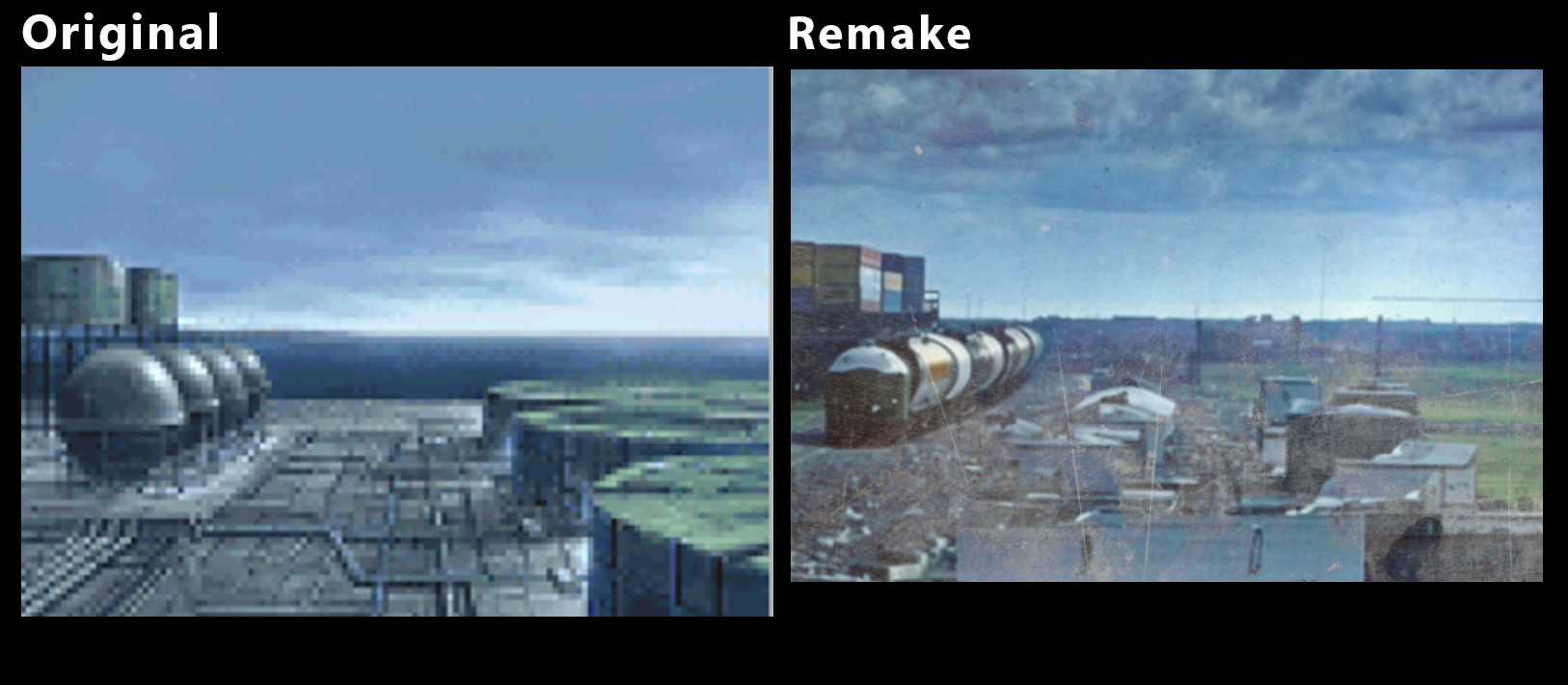
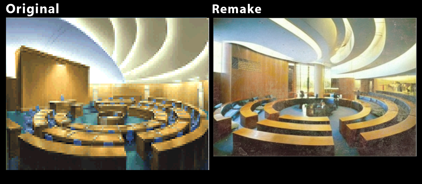
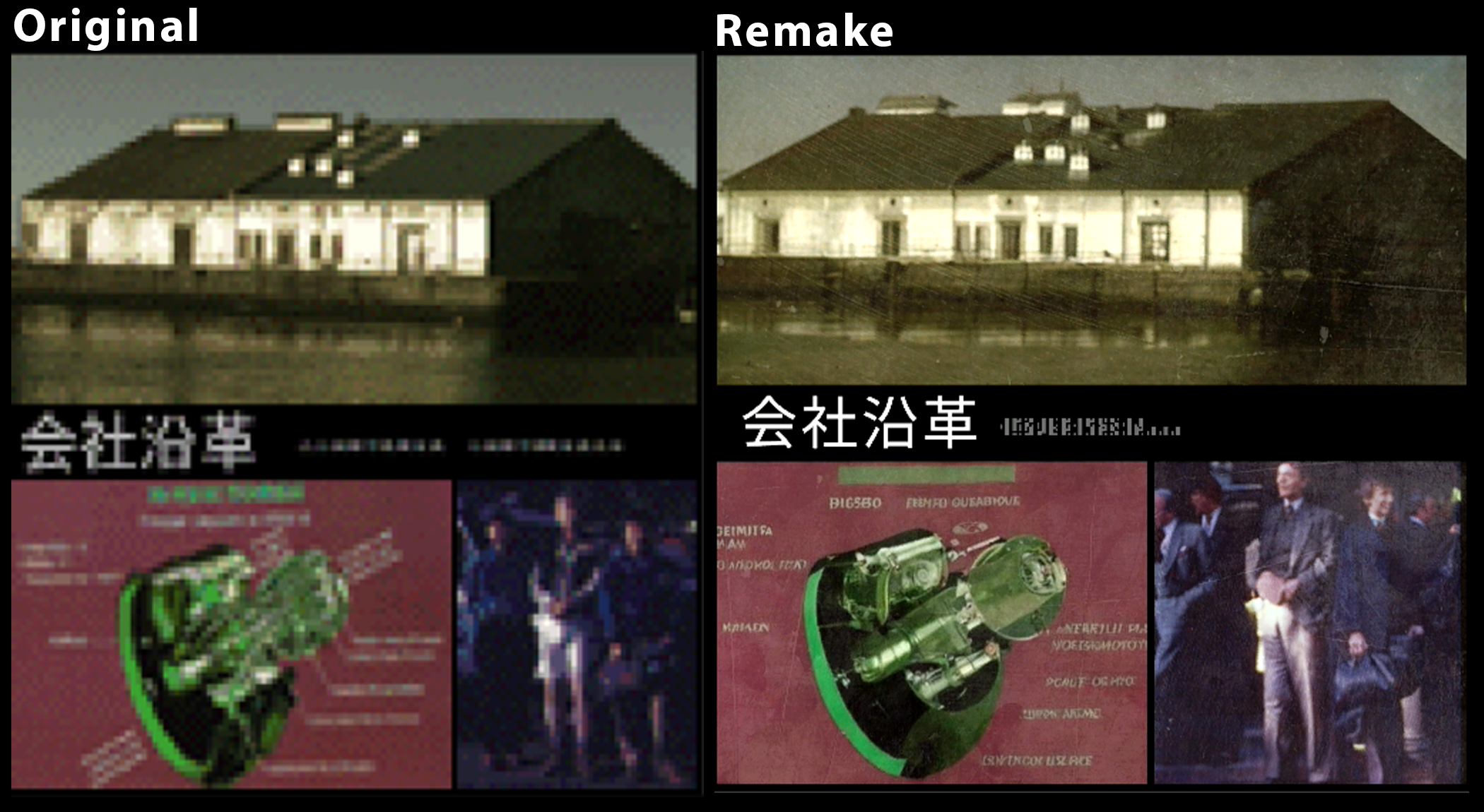
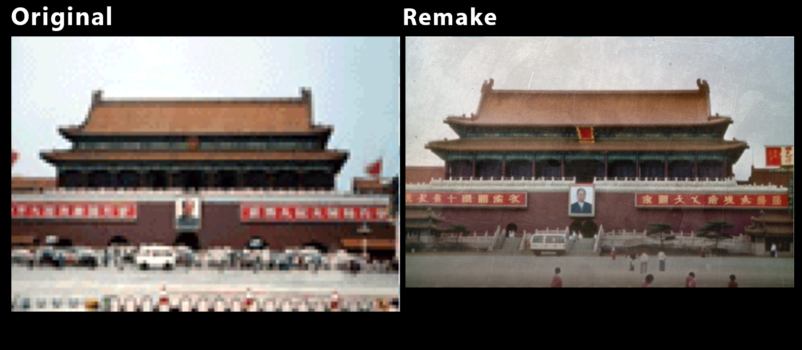
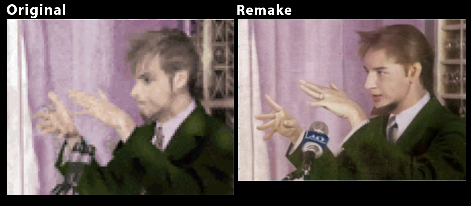
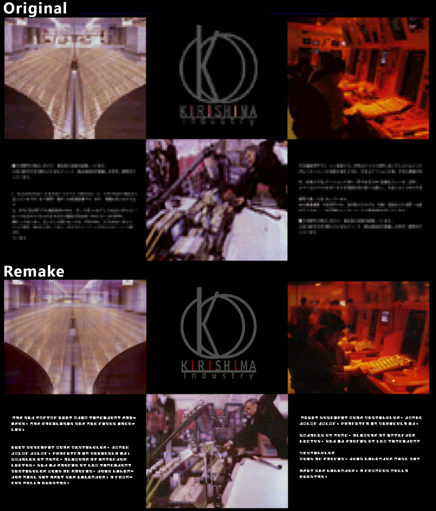
It's not until you dig into Front Mission 3's "Network" menu that a more obviously glaring issue with this remake rears its ugly head. For those who have never played the original game, the Network is an internet browser packed with in-universe websites to expand the lore of the game. You could spend hours browsing pages and reading about what's going on in the world outside of your little bubble. You can find hidden websites, or use it to order new Wanzer parts. There's a good chance you'll be logging into the Network after every story mission, so while the feature is technically optional, it's far from inconsequential.
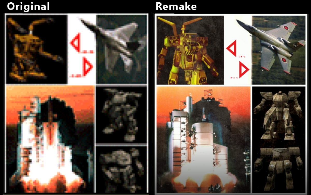
On these web pages, originally, were low-resolution images, often of photographs or drawn art. The remake now contains ... let's say "enhanced" (heavy quotes) versions of these new images, somehow re-created for the remake. The new images are evidently attempting to show what was in the original game, but to far less-than-ideal success.
To be clear, we don't yet have specifics about what happened here. We're not sure if this is an some combination of awkward upscaler, generative AI, and/or misguided hand-made updates - but we do know that the results are undeniably suboptimal. Nothing specifically about "AI" is currently mentioned in the credits page for the Front Mission 3 Remake, but examining the details of various images we suspect that the original pixelated images were fed into an algorithm that then hallucinated a lot of details that weren't there before. The higher the quality of the original image, the less likely this was to happen. This is why the character portraits are largely fine, and everything else suffers more considerably. There also seems to be a filter on almost all images (either applied by the development team or algorithmically) to mimic photographs shot on film.
Let's look at some examples.
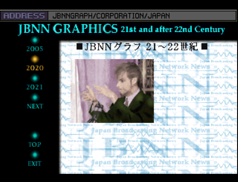
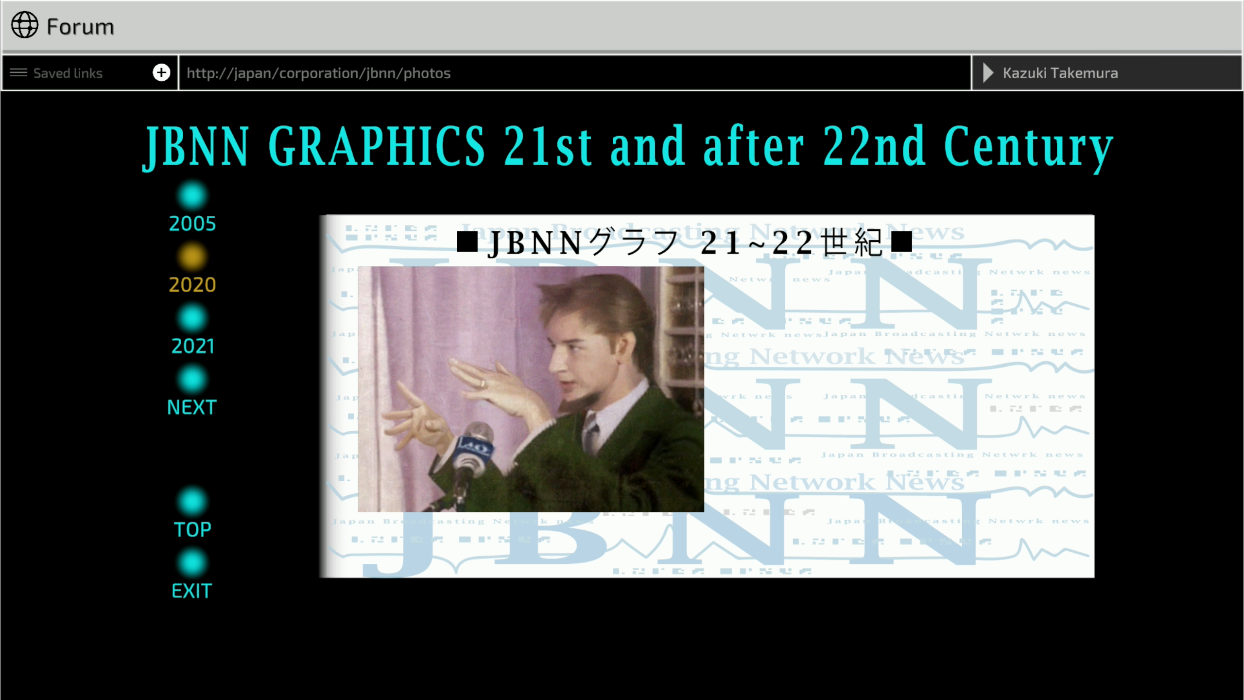
The first one that stood out to me was the image on the 2020 section of the JBNN graphics page. This shows a man speaking at the event where the U.C.S was created. The redone image has gone overboard with the man now having an uncanny and unnatural appearance. It's also seemingly been decided that he's married now, with the new detail of a wedding ring present. The background also seems to be awkwardly upscaled.
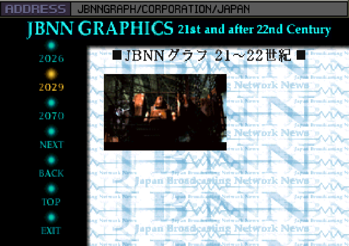
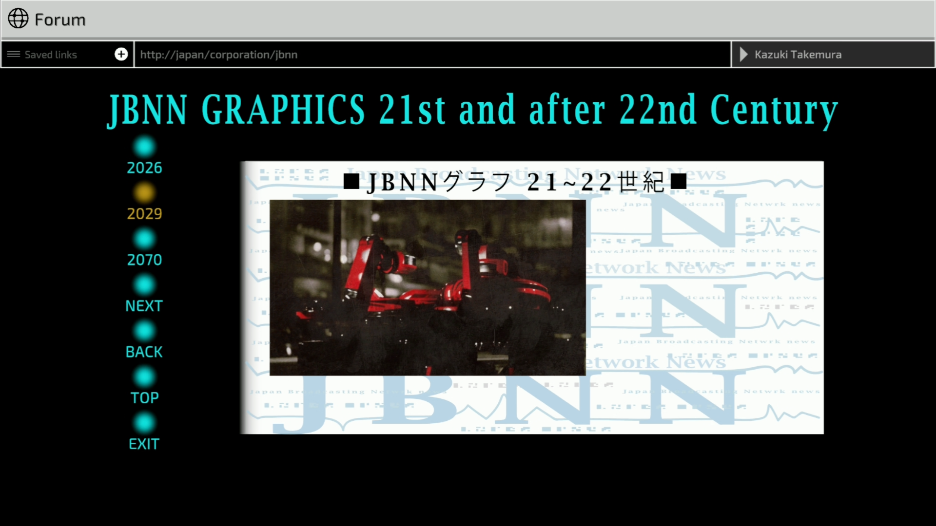
On the 2029 tab for JBNN graphics site, even though the original image is low resolution, it clearly shows the top half of a standing brown-orange Wanzer. The redone image, somehow, shows something entirely different - some sort of laser red vehicle. I honestly can't tell what this is meant to actually represent.
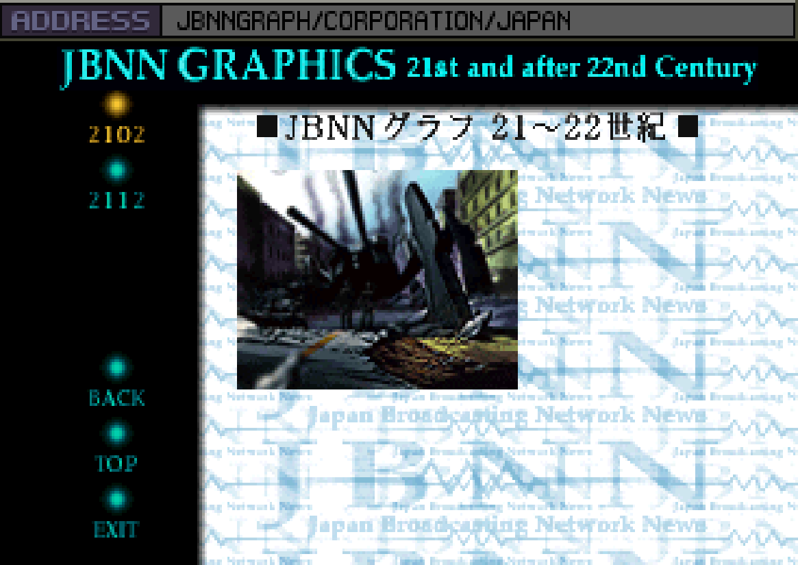
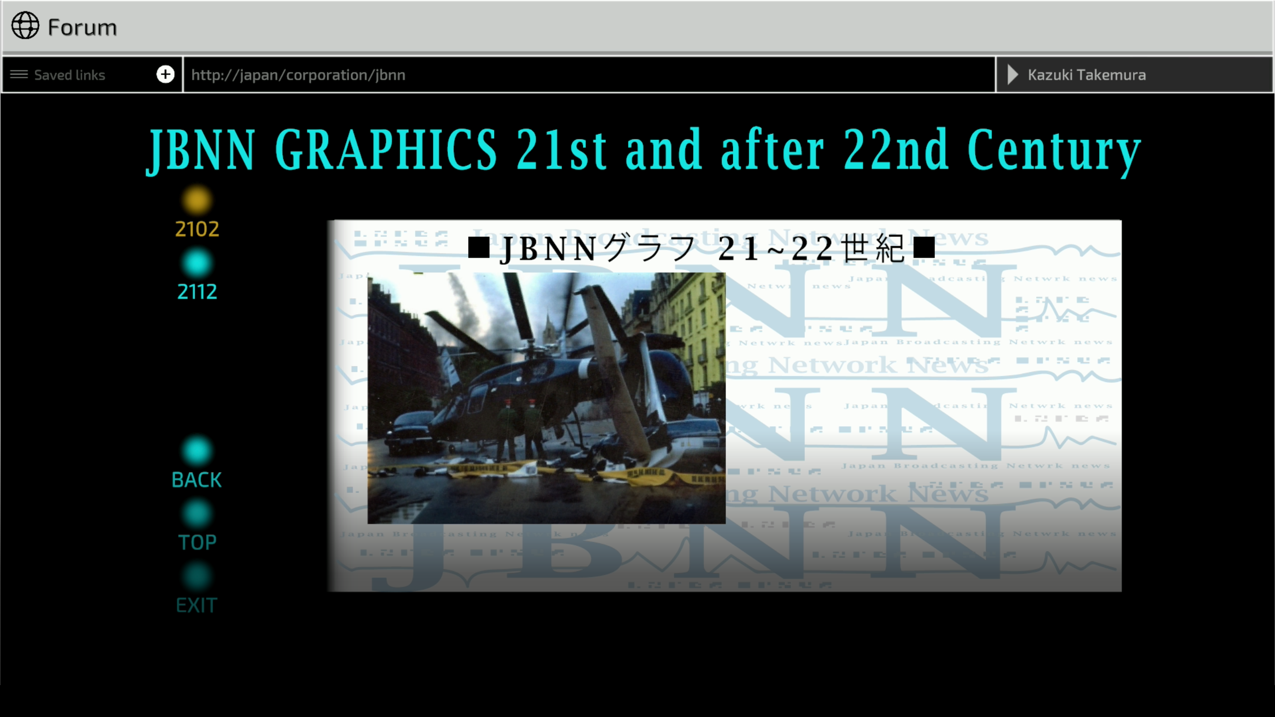
On the 2102 section of the JBNN graphics site, the Alordesh coup originally seemed to depict a crashed Wanzer. The redone image now shows some sort of monstrous helicopter with nonsense propellers. Also, there's caution tape now, and what seems to be a car fused with a boat?
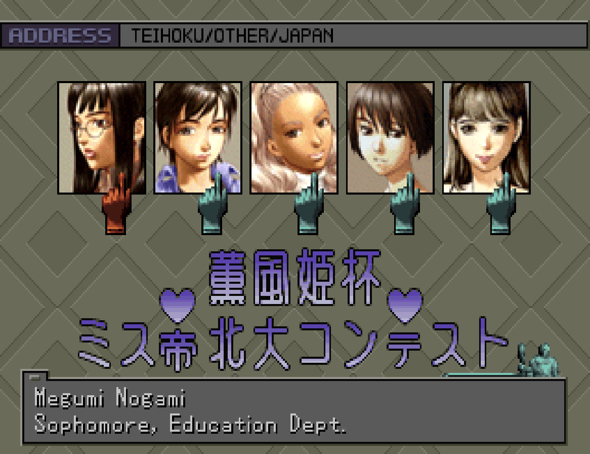
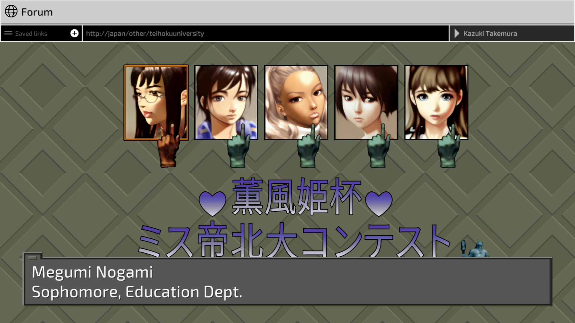
Next, we see some more redone character portraits on a page where women attending Teihoku University are discussed. It's not as egregious as some of the Wanzer examples, perhaps, but notice how pronounced the lips on all the women are now. Some of the women's expressions have also clearly changed from original to remake, either through negligence or misunderstanding.
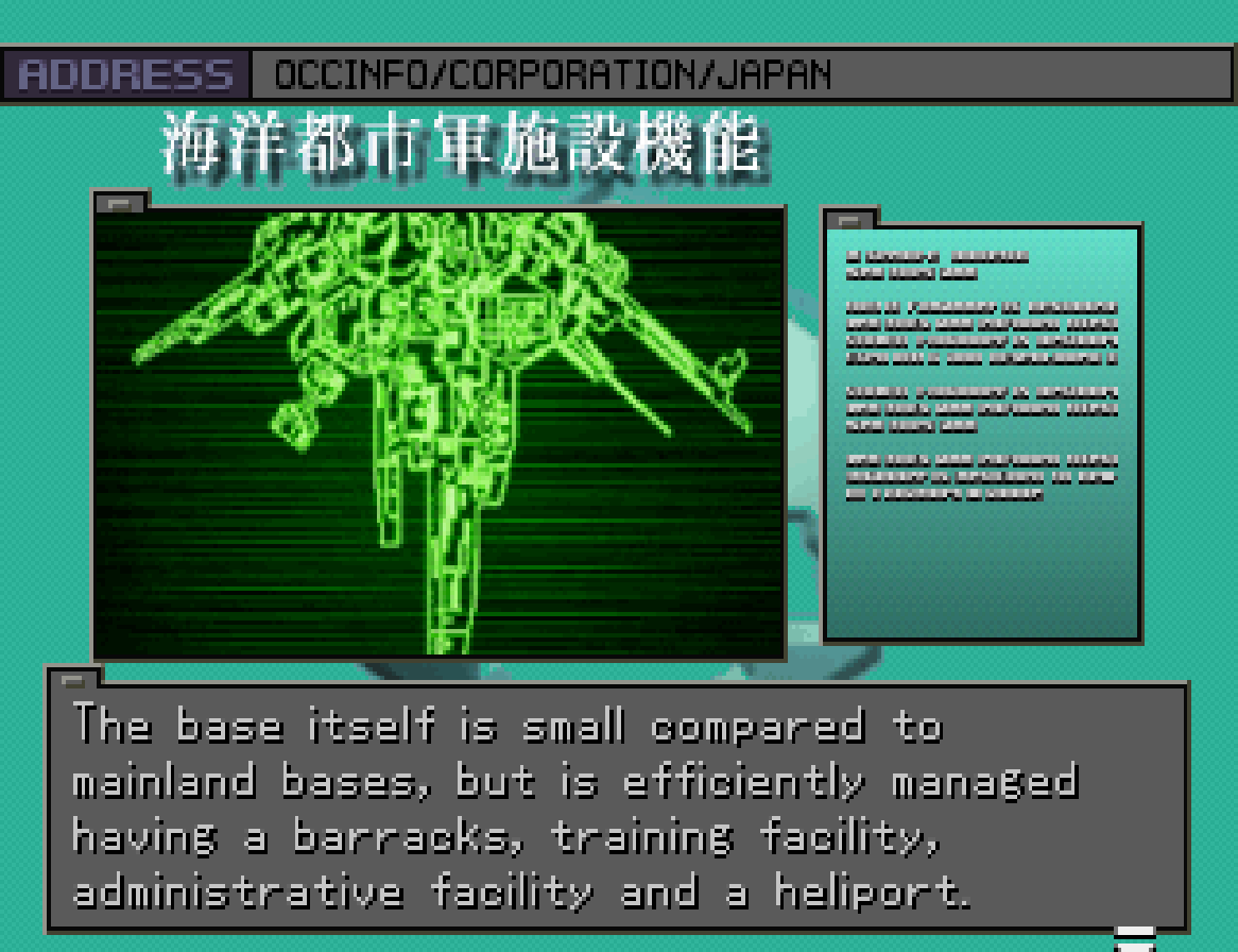
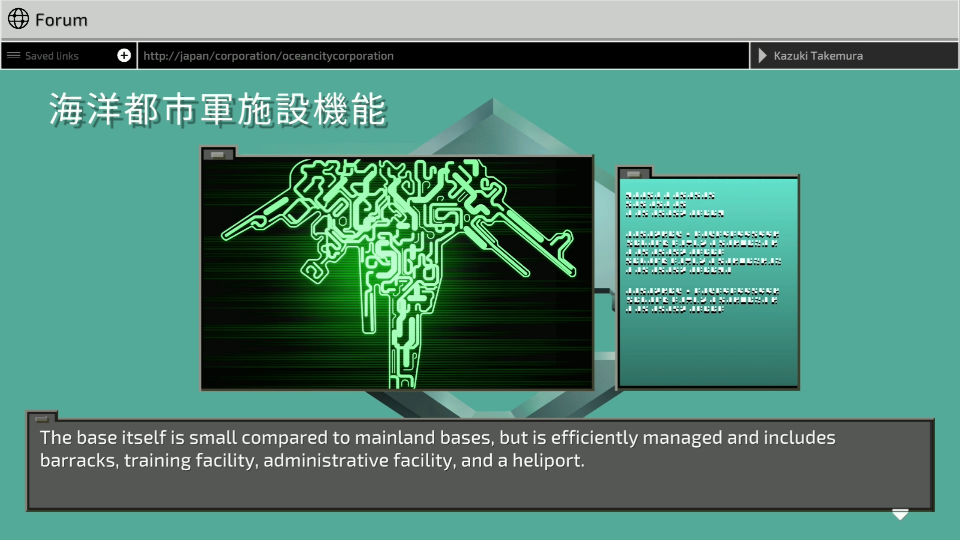
Here's what are presumably supposed to be mesh-like textures representing some sort of map or diagram. In the redone version, the green lines are over-defined, taking something that was never meant to be shown in this resolution and making it look like nonsense scribbles.
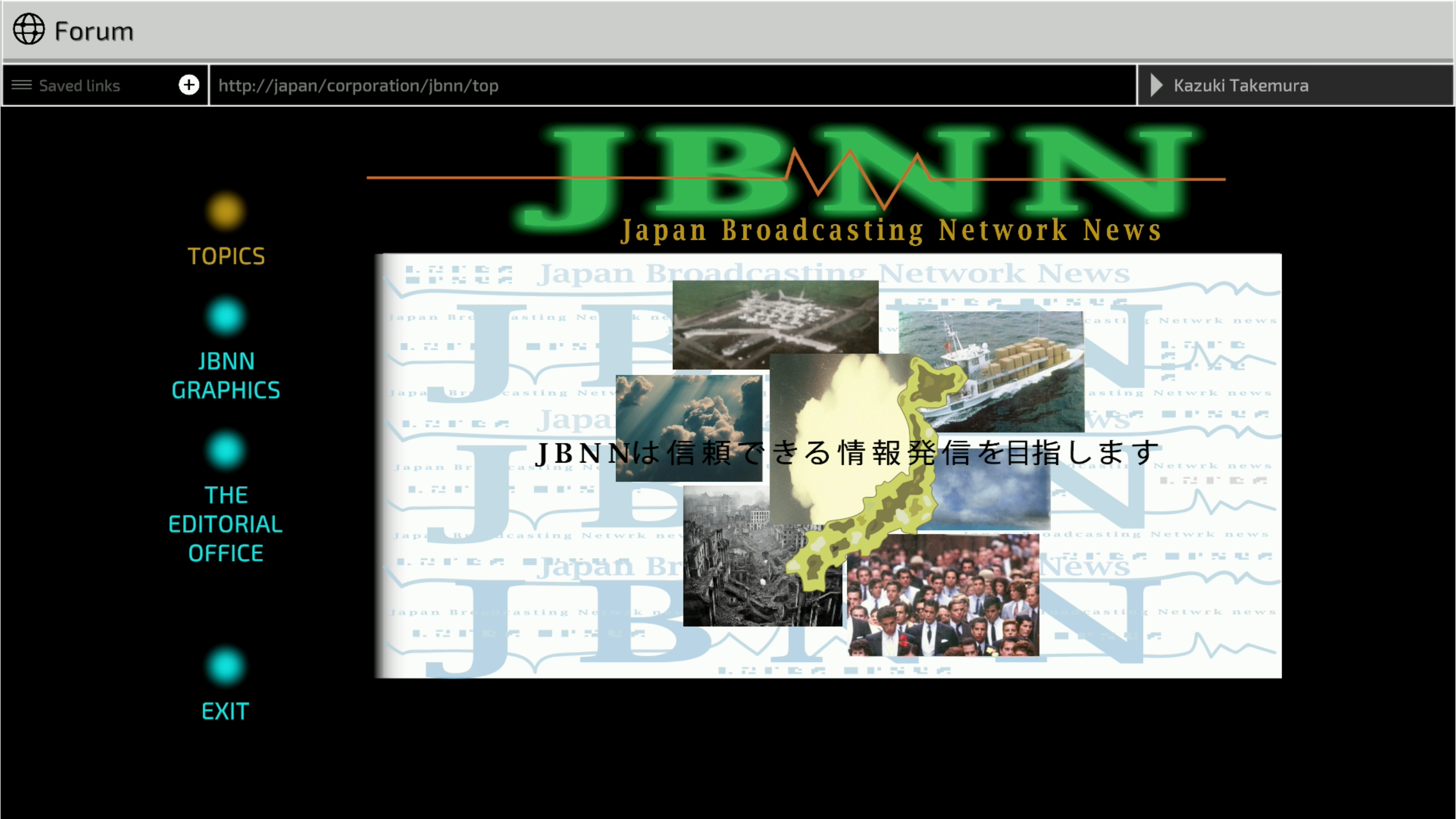
In some instances, it even seems like disparate elements were generated and haphazardly slapped together, attempting to mimic the original image. The JBNN's landing page is a total mishmash of incompatible elements that miss the point of the charming 90s-inspired web design. We see strange people walk around (who no longer look Japanese), as well as an explosion slapped in the wrong layer in the center.

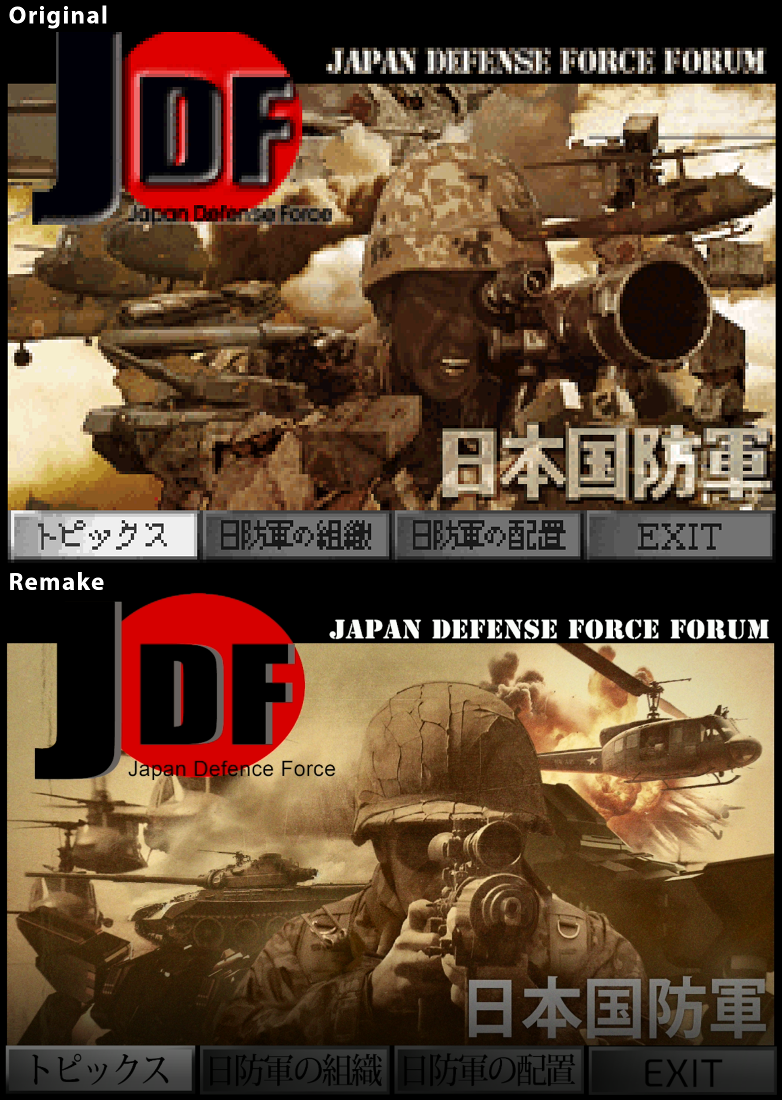
The most confusing comparison has to be the Japanese Defense Force Forum's home page, where now helicopters blend together, and a strange-looking gun is conjured up. For some reason, the soldier is also holding the fake gun like a camera. The only thing that doesn't look completely off here is the Wanzer. We have a feeling this is just using an image of one of the new 3D models, though.
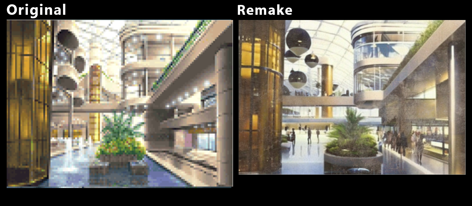
If you'd like to see more examples, here are some that we've compiled [Editor's Note: I particularly like the one where a fountain pool has seemingly turned into an ice rink]:
As it presently stands, it's unclear exactly how these images have come to be, and Forever Entertainment certainly has some questions to answer about how this imagery - some of it utterly bizarre - was created. If AI images are an ethical concern for you, you might want to avoid the Front Mission 3 Remake for now, at least until those questions are answered. Even if not, you might want to weigh up the virtues of this remake - where for all its visual improvements, the key feature that is its in-game internet has had its visual identity awkwardly warped. Consider this a PSA.